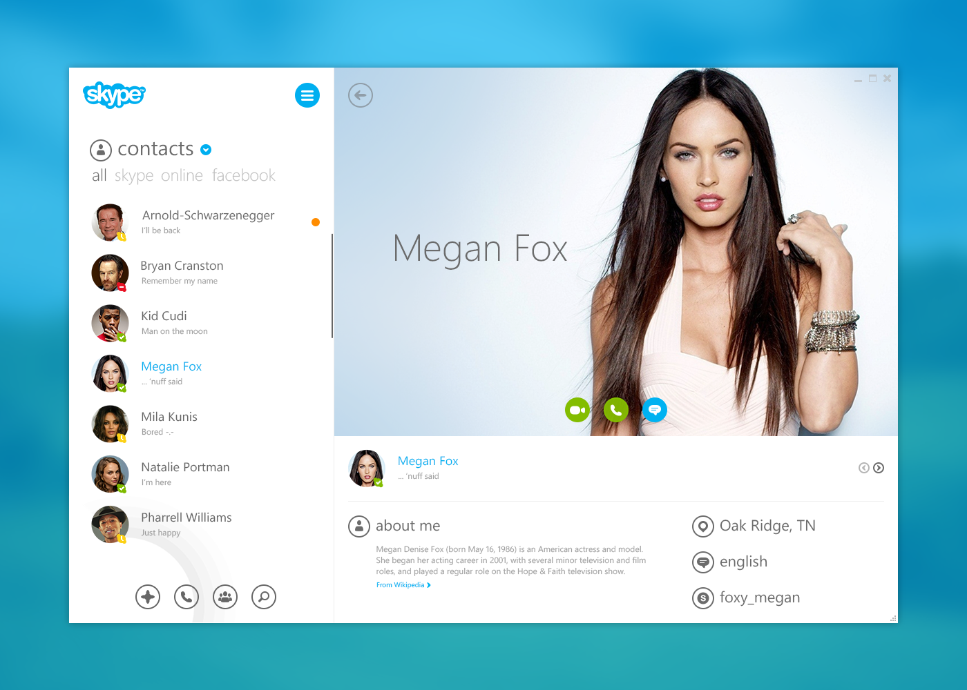
I’ve been using Skype for years and it’s pretty much my go-to app when it comes to messaging on desktop or tablet. Lately I’ve been thinking how to make the experience better since the Skype UI can get quite messy sometimes. So I decided to do a small redesign. I went for flat and Metro design to match the Windows Phone and the Metro version of Skype.
I’m in the process of updating this whole post with a fine-tuned expanded version and a bunch of nice extras. So if you read this, come back in a few days to see the concept in its full glory.
Login
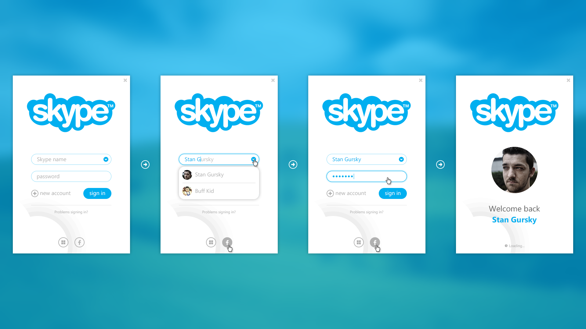
The login process is pretty straightforward and intuitive, just as a user nowadays would expect from a modern application.
Login process
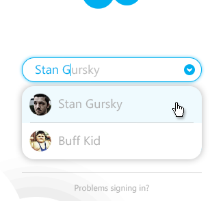
You can start by typing in your credentials such as your Skype name. The field has an autocomplete feature, which suggests a username that has already been used with that particular computer. Finish typing your name or select the available Skype username and enter your password. Boom! The forms morph with a nice animation into a loading screen with your profile picture and a welcome message.
You’re good to go and welcome to the real Metro version of Skype.
Alternatively you can log in with you Microsoft or Facebook account.
Left pane
Lists/Filter
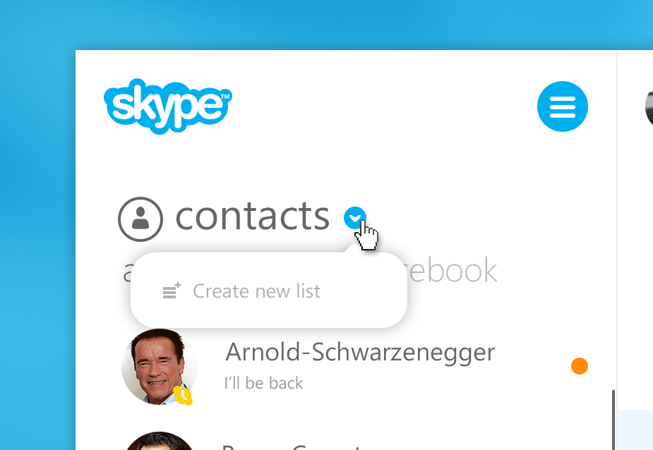
You can create and manage lists for you contacts by simply clicking the blue arrow at the top. You can also filter the current and selected list by different categories such as online status or which messenger the person is using (Facebook or Skype).
Contacts/Quick action buttons
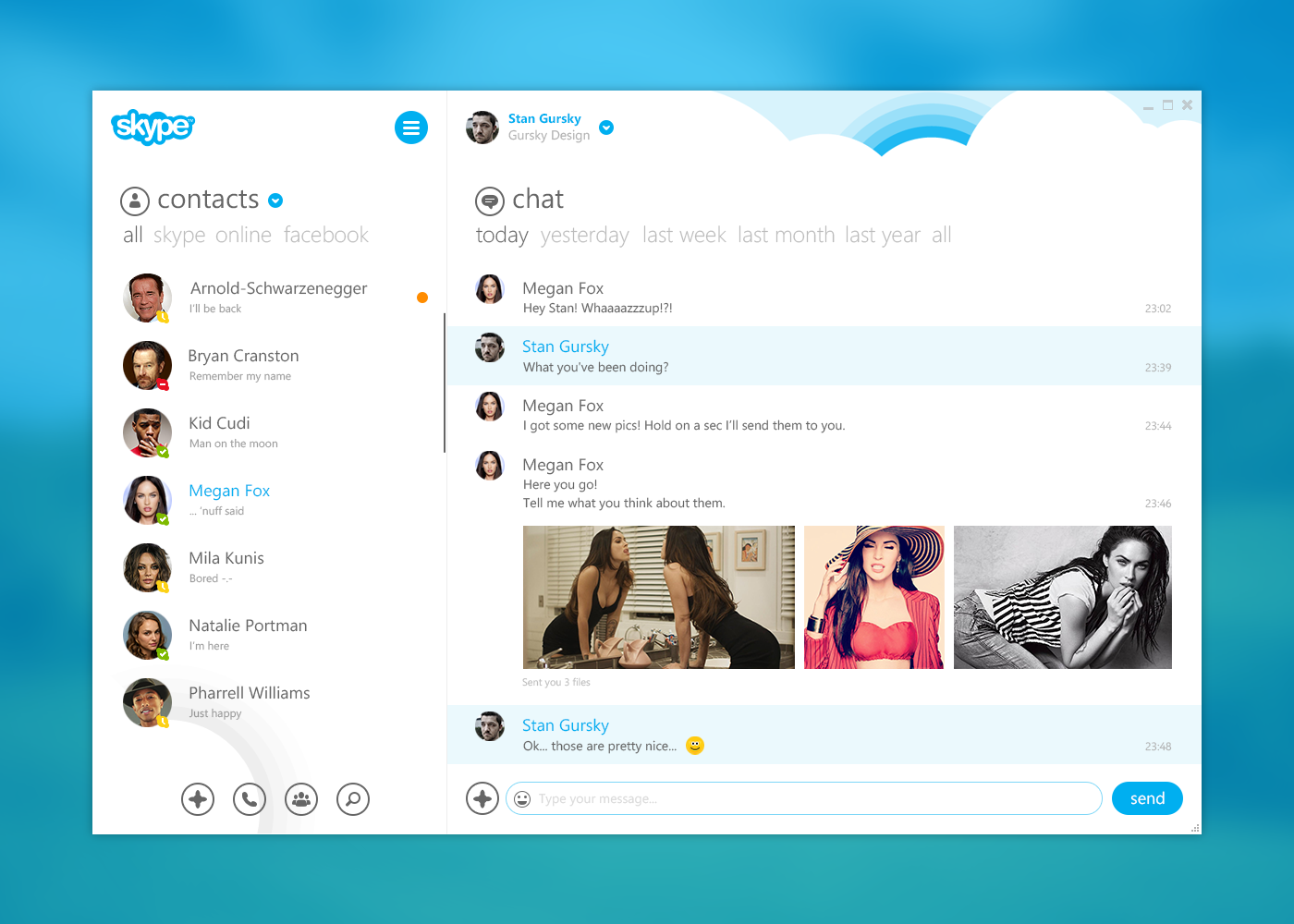
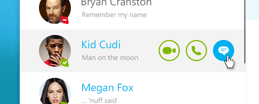
With the contacts on the left there are “Quick action”-buttons when you hover over a person. From you could (video)-call or chat with the contact.
Bottom buttons
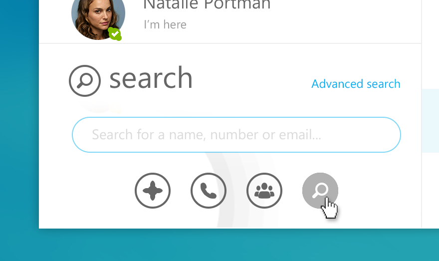
At the bottom of the left pane are four buttons.
– For adding a new number, person or email address in you contact list.
– To bring up the dialpad.
– To start a group conversation or a group (video) call
– To bring up search
Right pane
Chat/conversation window
On the right you can chat with your contact with inline images, videos, animated gifs and smileys.
At the top of the window you can jump through the current conversation sorted by date.
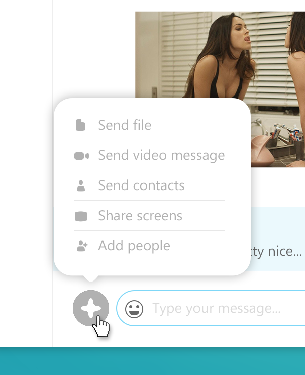
You can also send any file, location or simply add another person to the conversation by clicking on the “+”- button.
