App Name
Masked – Comic Book Reader
Masked – Comic Book Reader
Brand Design
UX Design
UI Design
Interaction Design
Prototype
Concept/Case Study
2014 – 2015
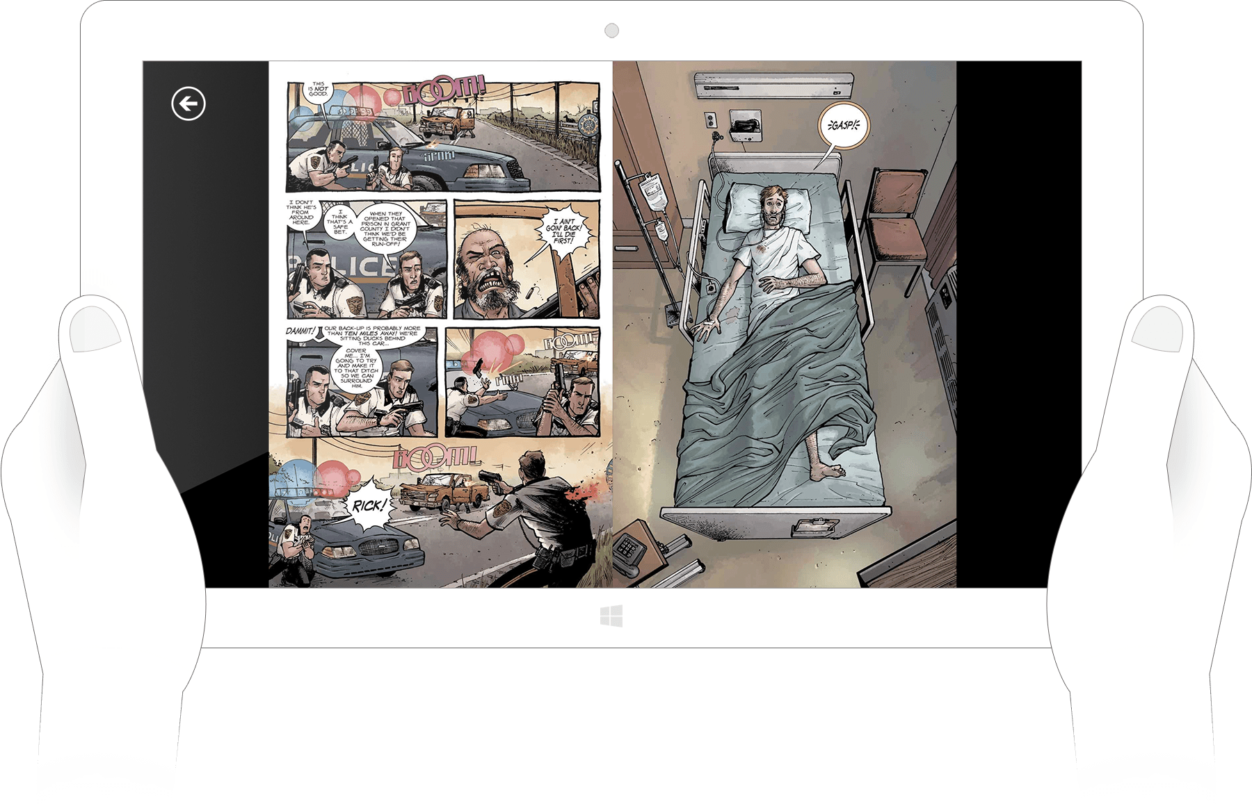
During the period when Windows Phone was gaining momentum and Microsoft introduced the concept of universal Windows apps, we delved into brainstorming ideas for potential new applications. Among these concepts was a comic book reader app designed for phones, tablets, and desktop users. The envisioned reader would boast a sleek and contemporary appearance, ensuring a seamless and unified experience for users indulging in comic books across all their devices.
Choosing a name for the comic reader posed an initial challenge. Eventually, we settled on “Masked,” a moniker complemented by a simplistic yet stylish facemask logo and icon. This choice pays homage to classic superheroes of yesteryears. To maintain visual comfort, the primary color palette encompasses darker shades of red and gray. For selective emphasis, a vibrant orange accent was introduced, harmonizing pleasingly with the darker hues.
The overarching goal was to keep the interface and elements discreet, prompting the exclusive use of flat and minimal styles. Gradients and skeuomorphism were purposefully eschewed to achieve an unobtrusive visual aesthetic.

Choosing a comic is effortlessly accomplished due to the well-structured grid layout (or an optional list format) that can be swiped horizontally. For books containing a series of issues or distinct story arcs requiring additional organization, I incorporated folders. Thus, when users click on a folder, they can access a deeper level displaying books from that specific story arc.
In addition, there are read-status indicators that activate when a book is opened, simplifying the tracking of read and ongoing issues. Further details about a book, including release dates and concise summaries, can be accessed through the info button.
For users with extensive comic book collections, search stands as a vital feature. Ensuring effortless book retrieval is a priority. The search icon is conveniently positioned at the top right corner on nearly every screen. Tapping this button triggers a full-screen search input window, complete with a field to enter any search term.
A noteworthy addition to the search function would be an auto-suggestion and live-search capability. This feature offers real-time suggestions and displays book covers as you begin typing into the search bar, further enhancing the search experience.
Engaging with a book or comic should be a tranquil experience, free from interruptions. Thus, our approach involves presenting a page or book content devoid of buttons or user interface components. Navigation is accomplished solely through swipes and taps. By tapping the screen once, a discreet UI emerges, offering crucial interactions such as search and the option to navigate to specific pages.

As we were targeting a Universal Windows App, the mobile version would have shared the same features and functionalities. The sole distinction would have been in the app’s layout and how the elements adapted to the smaller screen.
Imagine reading a comic book at home before heading to work. With our approach, you could seamlessly pick up where you left off, whether you’re on a train or traveling to the office. The sync would be flawless, providing a continuous reading experience across various settings.
By the way, it’s fortunate that there are individuals with the time and development expertise to create a comic book app for Windows that closely aligns with our initial plans. If you’re a Windows-based comic book enthusiast seeking the finest reader currently available on the platform, I strongly suggest exploring “Cover” by FrenchFry. It’s an exceptional app I personally use whenever I’m on a Windows tablet or phone.